
What turned out to be my last major job before starting at King Arthur was a new website for Second Growth, a local nonprofit dedicated to treatment, recovery, and prevention of substance abuse in adolescents and young adults. Before I came on board with Aquilino Arts my partner had set them up with a lovely Joomla site, but it was hard to update in terms of both content and software. It was time to shift to WordPress, and clean up and reorganize a little at the same time. I was involved in the organization – though we stuck fairly close to the previous structure – and gave feedback and input on the design, but my main job was the technical aspects. I wanted to discuss them here because it is our most sophisticated site to date and it gives a fairly thorough overview of my methods for site construction.
By the way, I have a Pinterest board devoted to plugins we use, which you can take as recommendations.
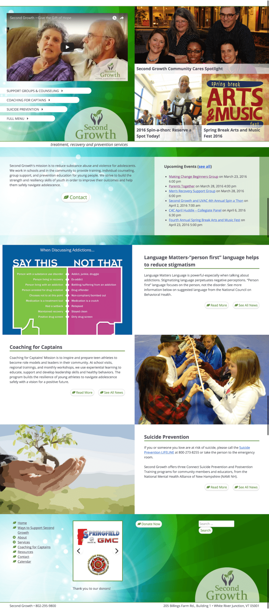 The front page starts with a mosaic; the left half has a YouTube video and a mini-menu, the right half is split into 3 pieces whose contents can be changed from within the Customizer. The theme is set to use two menus, intended to be the mini-menu and a full menu. The mini-menu includes a link to the full menu; the full menu appears in the footer, which is where the link goes, but if you have JavaScript, it hijacks the link and pops the full menu up in a lightbox (the method is shown almost exactly in my post about AJAX in WordPress).
Below the mosaic and a divider band, there are three more spots whose contents can be set in the Customizer. In every case the options are a page, a specific blog post, or the latest blog post. The footer includes not only the full menu but a 2-up slider of donor logos. The gallery uses Media Library Assistant to allow logos to be selected by categorizing them appropriately on the back end and is set to have two columns and random order. Flickity applies itself after page load and turns each column into a panel of the slider. All gallery/slider and lightbox functionality (which is via Colorbox) is in a custom plugin so it can persist should they change their theme down the road. The choice of Flickity and Colorbox is semi-arbitrary; I’m familiar with both of them and they do what I want. I’ve never written about Colorbox here, but I’ve written fairly extensively about Flickity.
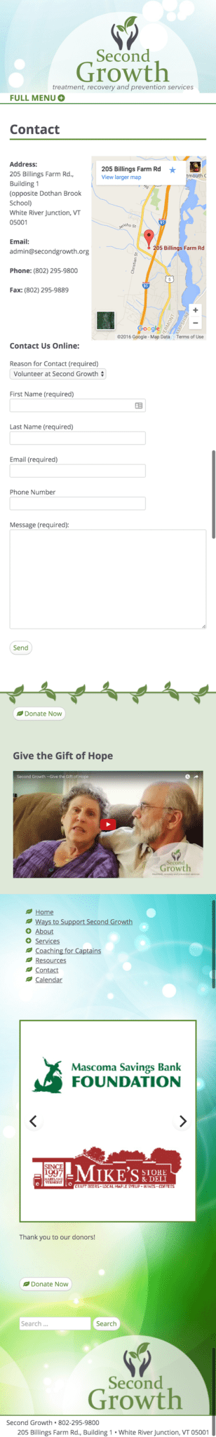
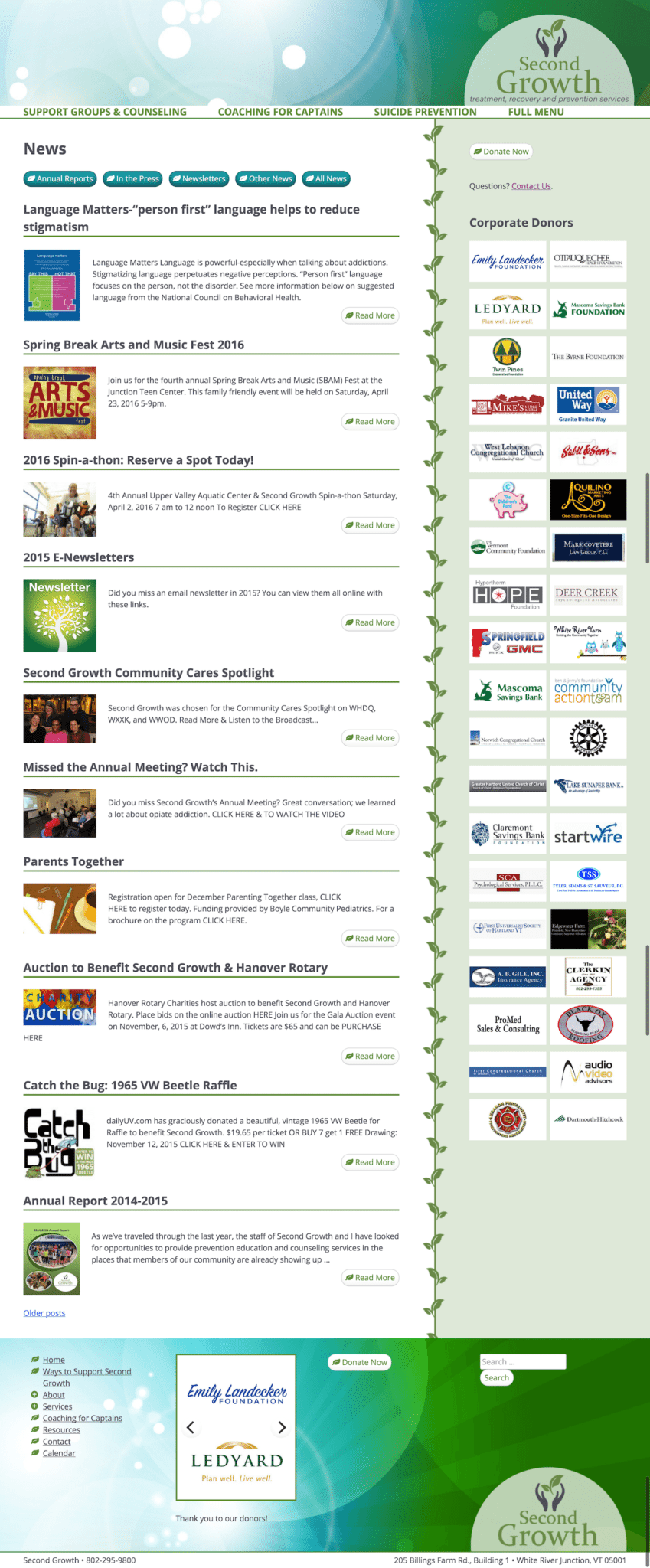 On interior pages the mini-menu appears as the top-of-page menu; the logo gets you back home if you don’t want to use the full menu popup. Certain content is accordion-folded, which is also provided by the custom plugin but is hand-coded. Different pages have different sidebar content via Display Widgets, chosen as the least awkward of the options. Almost all of them have a donate button and contact link; most have a two-column gallery of donor logos; a couple have a still of the home page’s YouTube video that lightboxes up into a watchable video. One has 1-up slider of photos, chosen via Media Library Assistant’s tagging system.
The contact form is from Contact Form 7, because of the option of Selectable Recipient with Pipes, including the ability to use the pre-pipe content by prefixing the label with _raw_. The event calendar is Event Organiser, chosen because it does recurring events and is developer-friendly. I didn’t end up turning off the original CSS, but I found it reassuring that the developer included that option. It provides for per-category colors, which we used to make one-off events stand out from weekly recurring events, and also produces the lists of upcoming events that appear on the home page (set to show only the next instance of any recurring event) and in the sidebar of one of the interior pages.
There are two custom post types aside from contact forms and events, both created and given custom taxonomies using Custom Post Type UI. One is testimonials, which currently only exist in the sidebar of one page (a single random one selected and shown by Flexible Posts Widget with a custom template – and by the way you can get all my custom FPW templates on GitHub). The other is resources. The resources archive and news (blog) archive look similar: they are topped with buttons for each category (or topic, the resource-specific hierarchical taxonomy) and for the whole archive. These buttons are coded into the archive templates. The list of all resources actually excludes one of the categories; resource archives also display alphabetically by title instead of by date and with more allowed per page.
The news archive shows the featured image and an excerpt; the resource archive shows the full content with no image. Featured images aren’t set to automatically show on any of the individual posts or pages; they are used for the front page featured content and news archive only.
 The theme is fully responsive, and below a certain width the two-column donor logo galleries are hidden so as not to make the page infinitely long. When at “full size” the right sidebar is positioned and sized via
 display: table-cell. This caused some problems on Firefox with the pages with the video still in the sidebar, where the sidebar was displaying far wider than it was set to (35%). The fix was to set width: 100% on the still (in addition to the max-width: 100% set on all images in the theme). It was tricky to repair because my browsers have gotten very tenacious about using the old CSS file, regardless of hard refresh or cache clearing, until I change the version number. I’d switched to CSS tables because I was having the same problem in Flexbox, but since then have determined the same fix would have worked for Flexbox.
Using CSS tables or Flexbox was important for getting the main content and sidebar to be the same height, since the leafy divider is actually a small vertically-repeating background image on the sidebar, transparent beyond the leaves on the sidebar side and with solid white background (covering the translucent green background of the sidebar) on the main content side. When the sidebar drops below we switch the image and its positioning and repeat settings.
Originally the footer used CSS columns, as well as the sidebar when it dropped below but had width enough for multiple widgets, but then I discovered Flickity doesn’t play well with CSS columns. At all. I had crazy spillover outside the Flexbox viewport that I couldn’t figure out how to fix. No more CSS columns; they are now done the old fashioned way with percentage width and floating.
The behind the scenes plugins in the site are WP Smush for image optimization, WP-SpamShield for comment spam elimination, Google Analytics by Yoast, and W3 Total Cache for caching. With such an image-heavy site both image optimization and caching are key elements. I didn’t use WP Fastest Cache because the free version has to be cleared from the hosting account if you haven’t just published a post or page – changing the featured items in the front page won’t do it. W3TC doesn’t detect changes in the front page but you can clear its cache from a button at the top of any of its pages.