For reasons that have now become obsolete, I had a background image carved into several pieces that needed reassembling. In fact, I had two versions, shown (not to scale) below.
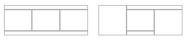
The first was easy to assemble: three divs corresponding to rows, the middle of which held three more divs. The divs of the middle row had to be styled with display: inline-block; so they wouldn’t bump each other to the next row. All of the divs were given appropriate width and relative position. The images inside all of them also needed max-width: 100%; in order not to explode out of their housing. It’s easy to display visually for reference further down this post:
- div for top
- image
- div for middle
- left div, display:inline-block
- image
- center div, display:inline-block
- image
- right div, display:inline-block
- image
- left div, display:inline-block
- div for bottom
- image
The second took more steps: the left side was on its own and the right boxed into a div. On the right, then, the top had the default block display, the right-hand side was floated to the right, and the other two were inline-blocked under it (“under” in the HTML). I could also have made two inline-block divs for the lower right hand trio of divs, one for the stack of two and one for the right-hand side. That might have fixed one whitespace issue I had. Again, everything needed appropriate widths.
Actually if you are just starting out I recommend this exercise as terrific hands-on exploration of the CSS visual formatting model. You will build your intuition for layout.
Anyway! Once the pieces were arranged properly there was a good bit of whitespace all around everything. Some of that was fixed with a margin reset:
body {
   margin: 0;
}
Some was fixed by removing whitespace (line breaks and tabs) between divs in the HTML file. Some was fixed by setting vertical-align: top; on the containers that hold images, though that became redundant when I applied the next paragraph’s settings. Bear in mind that vertical-align is not inherited (it is set to “baseline” by default) and also applies only to inline elements (including divs set to inline or inline-block display).
A significant amount of whitespace was fixed by setting line-height: 0; on the divs. Actually, this is an inherited property (i.e., set to “inherit” by default) so you can set it anywhere up the chain that you like, but remember to set it back to “normal” in any divs that contain text. All inline elements are treated the same way as text, which means space for descenders (the tails of p, q, j, and g) is left below the baseline, on which the image sits by default. This JSFiddle shows several options including line-height, though they didn’t all work in isolation for me. I had a div containing text inside the center div of the left-hand layout, which probably complicated things, and I found that either line-height of zero or both display:block on the images and vertical-align:bottom on the left, center, and right divs closed everything up. Neither of the latter fixed all the space on its own, but either of them in conjunction with line height of zero scrunches up some portion of the page.
There was one sliver of whitespace I could not get rid of by any of the methods above, nor many other attempts setting zero margins and zero text sizes and leftward text alignments and so forth: to the left of the right-floated div of the second arrangement. I finally was able to close it up by setting margin-left: -.25px; on the image inside the div. This is the whitespace issue I alluded to above, that would most likely have been fixed with an inline-block layout in place of a float. Since this little game was no longer relevant to the page I’m drafting, though, I decided it was time to move on.