Suppose you have a web page where a certain component needs to sit within a particular region of the background image, and you’d like the whole shebang to resize according to the browser window and maintain this alignment. That is, the position of the items relative to each other and their aspect ratios need to hold constant even when their sizes and distance from the edges of the browser window are changing. This post is about aspect ratio; a later post will address relative positioning.
Horizontally there is no problem. Declare width: and left: as percentages, which will be relative to the screen size, and as it changes, they will change in tandem. Vertically there is a little more work to be done.
There is a well-established way to preserve aspect ratio via padding, which is calculated (when set as a percentage) relative to the width of the object rather than the width of the screen. The most complete tutorial I found on this was by Chris Wainwright, and I recommend it.
I had to make some changes, though. I didn’t have a wrapper div within which my padded div was 100% of the width; I set a percentage-of-screen width on my padded div directly. When I set padding according to my desired aspect ratio, the resulting div was enormously tall.
An example using numbers I have at hand: suppose the design has a segment that is 459 x 1358px, which has a 1:2.96 aspect ratio. Setting the padding to 296% produces an aspect ratio of 1:12.33. What is 12.33? Why, it’s 296/24, and 24% just happens to be the amount of screen width the segment was set to take up.
You can solve this with a tiny bit of algebra: if (actual padding) = (coded padding)/(width), then (coded padding) = (actual padding)*(width). In the latter equation you drop your desired aspect ratio into the “actual padding” slot. In this case, to get an aspect ratio of 1:2.96 on my 24% wide div, I have to set padding of 2.96*.24 = .7104 or 71.04%.
I reiterate that this is percent width relative to the container. For a single div you can avoid the arithmetic (and arguably make your code more readable, since the padding percentage will be the aspect ratio) by wrapping the padded div in a div of the desired width and letting the padded div have width 100%. This is, of course, how it’s done in the tutorials, but I haven’t seen one that explains why or warns against leaving the wrapper out.
However, if you have a vertically sliced background image to reconstitute I have found it’s actually better to set width on the padded divs directly, but with all padded divs inside a shared wrapper that they completely fill. The reason is that in this setting the padding on each individual div will be the aspect ratio of the entire unsliced image.
Here’s the algebra:
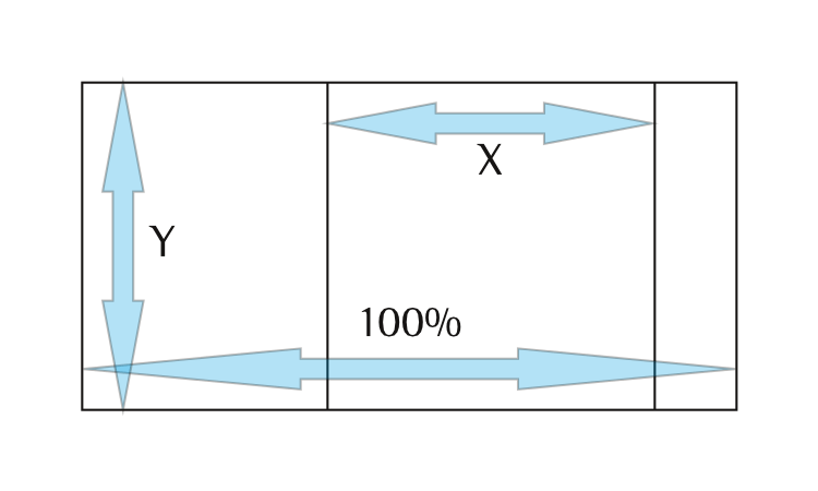 Assume the width of the whole image is 1, which makes the slice’s width X both raw and as a percentage. The slice and the entire image have height Y, so their aspect ratios are Y/X and Y/1. To get the coded padding we multiply the actual padding, Y/X by the percent width, which is X, resulting in Y (i.e., Y/1).
We can assume the unsliced width is 1 because to make it so is a unit of measurement conversion, which plays well with others. For example, if the actual width is 5000, and X and Y are raw measurements (X no longer serving as a percentage), the aspect ratio of the slice is still Y/X, the aspect ratio of the whole image is Y/5000, and the width of the image is X/5000. Multiplying actual padding (aspect ratio) by width then gives Y/X * X/5000 = Y/5000, the aspect ratio of the whole.
Anyway, algebra aside, this does save you some arithmetic, because the padding on the individual divs is all calculated with one division. The second part of this involves unraveling the quirks of percent margin, though this sentence should not be taken as a promise of its quick appearance.